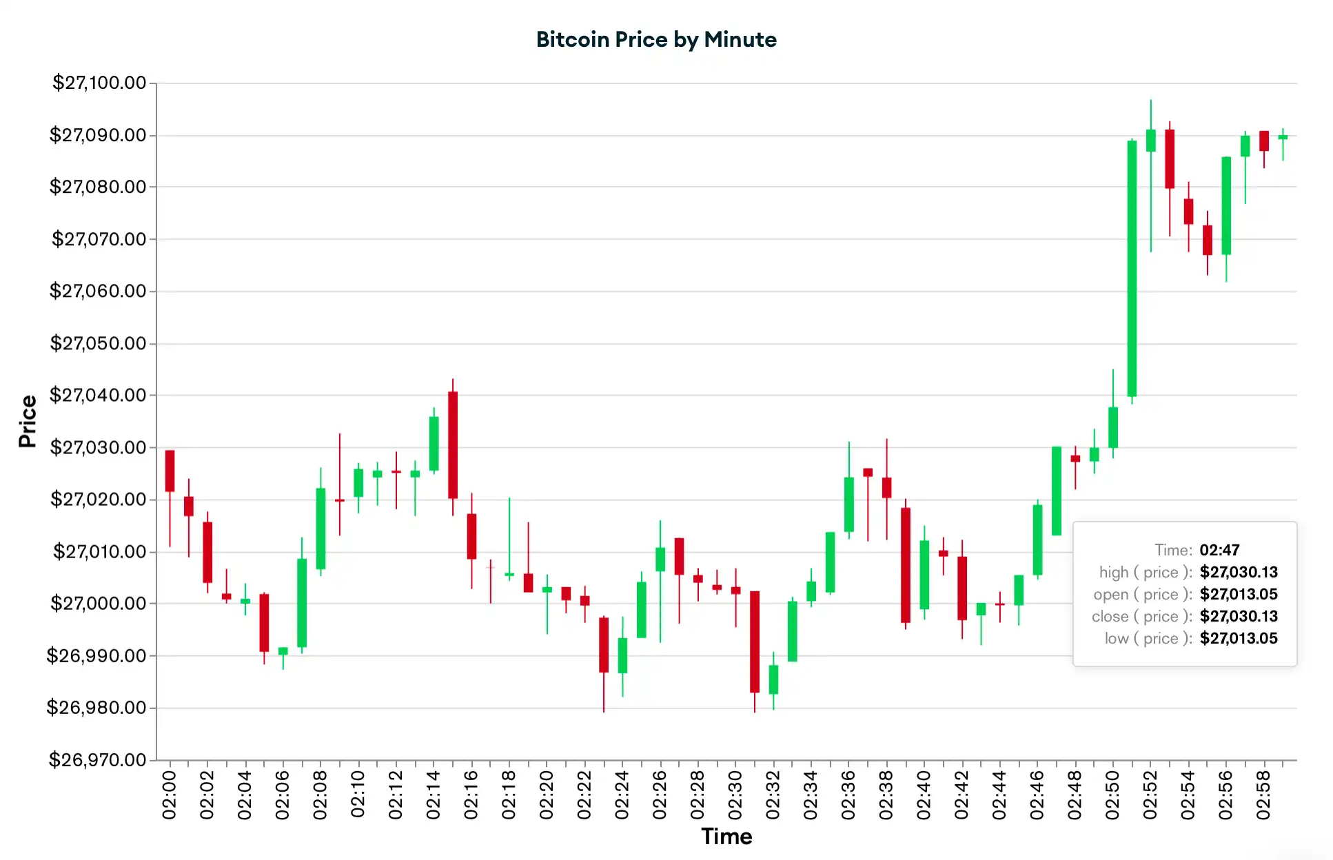
You can use candlestick charts to visualize how a numeric data source changes over time. A candlestick chart consists of vertical columns, or "candles," that represent a range of your data source's opening and closing values over a period of time. If the closing value is higher or lower than the opening value, the column fills a certain color to indicate either a positive or negative change. Each column also might extend in either direction to show the highest and lowest values during the time period.
By observing the columns in your chart across consecutive periods of time, you can identify patterns in your data and make informed predictions. To learn about when you might use a candlestick chart, see Use Cases. To learn about all column chart types, see Column and Bar Charts.
Candlestick Chart Encoding Channels
Encoding Channel | Description | ||
|---|---|---|---|
X Axis | The category encoding channel for your date field. This channel creates a segment for each time period along the X axis based on the grouping that you select. By default, Atlas Charts enables binning to group date data into specific time periods. You can choose from the following bins:
For certain bins, you can enable the Periodic setting to visualize the aggregated results for the time period across your data. To learn more, see Bin, Sort, and Limit Your Data. | ||
Y Axis | The value encoding channels for your numeric data. Charts requires the following values:
To define these values:
|
Use Cases
Candlestick charts are useful for visualizing time series data when you want to analyze a numeric measurement that changes over time. This type of chart is commonly used in financial analysis to track the price of assets such as stocks, commodities, or currencies. However, you can use candlestick charts for various types of data to suit your specific needs.
Consider the following examples:
A trading firm tracks the stock price of a specific company by hour to make a trading decision.
A weather company tracks rainfall, snowfall, and temperature by day to predict next week's forecast.
A store owner tracks the cost of a specific item by month to determine the best time to restock inventory.
Customization Options
The following customization options are specific to candlestick charts. To see all available customization options, see Customize Charts.
Customize Candlestick Color
You can customize the colors that correspond to a positive or negative change in your chart:
Click the Customize tab for your chart.
In the General section, enable the Custom Color Palette.
In the dropdown next to Positive or Negative, use the color picker to select your desired color. To learn more, see Color Palette Customization.
Adjust X-Axis Label Angle
You can adjust the X-axis label angle to one of the following options:
Option | Description |
|---|---|
Vertical | Labels right-aligned at a 270 degree angle. |
Horizonal | Labels center-aligned at a 0 degree angle. |
Diagonal | Labels right-aligned at a 315 degree angle. |
To set this option:
Click the Customize tab for your chart.
In the Axes section, select a Label Angle for the X Axis.
Example
The following chart visualizes the price of Bitcoin in US dollars
as it changes every minute. The chart uses a time series
collection
called ticker, where each document in the collection
represents a specific financial asset at a point in time. Each
document includes information about the asset's ticker symbol,
price, and time.

Tip
To show the exact data values in a tooltip, hover over the body of a column in the chart.
The X Axis category channel, represented by the ticker.time
field, bins the numeric data by minute. The value
encoding channels, represented by the ticker.price field, aggregate
the high, open, close, and low prices during each minute to create the
vertical columns in the chart.
The chart also uses query filters
on the ticker.symbol and ticker.time fields to include
only results with the BTC-USD symbol and limit the chart to an
hour-long subset of the data.
When the asset's closing price is higher than its opening price during a given minute, the column fills green to indicate a positive change. When its closing price is lower than its opening price, the column fills red to indicate a negative change. Each column also might extend in either direction to show the highest and lowest prices during each minute. Based on your analysis of the chart, you might make a decision to purchase, hold, or sell the asset.