Column and bar charts plot data in either horizontal or vertical segments where the length of the segment is proportional to the data value. Column and bar charts provide high-level overviews of data trends by comparing values within a specific category.
Column and Bar Chart Encoding Channels
Column and bar charts, except for the candlestick chart type, provide the following encoding channels:
Encoding Channel | Description |
|---|---|
X / Y Axis |
|
Series | (Optional) A category encoding channel that segments the axis category based on the unique values in this field. If omitted, Atlas Charts renders a basic bar or column chart with just a comparison of the X Axis and Y Axis fields. This option is only available for Grouped and Stacked charts with a single field mapped in the aggregation channel. |
Color | (Optional) An aggregation encoding channel for Colored charts that changes the bars or columns' colors to reflect the aggregated value of the field, with darker colors meaning greater values. |
Column and Bar Chart Types
Column and bar charts provide the following sub-types:
Sub-Type Name | Description |
|---|---|
Atlas Charts groups data by the category specified in the category encoding channel, and plots a bar or column for each value in the Series encoding channel.  click to enlarge For a more detailed example, refer to the grouped column chart example. | |
Atlas Charts creates a bar or column for each distinct value in the category encoding channel field, and splits each bar or column into segments based on the the Series encoding channel. 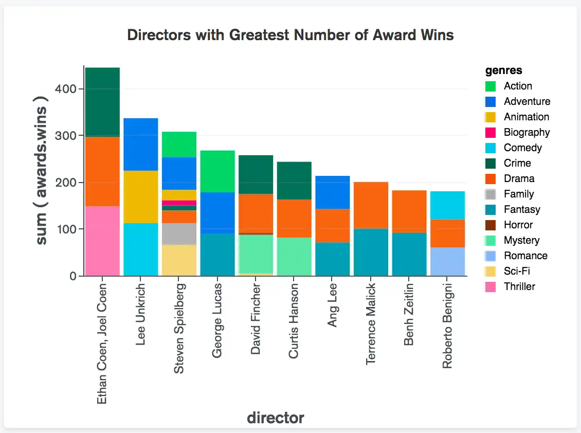 click to enlarge For a more detailed example, refer to the stacked bar chart example. | |
100% stacked charts behave similarly to traditional stacked charts, with the difference that in a 100% stacked chart each bar or column is normalized to a consistent value of 100%. Just as with traditional stacked charts, each bar or column is split into segments based on the Series encoding channel. Each series is shown as a percentage of the whole. When using a traditional stacked chart, it can be difficult to compare the proportions of each series to the whole if the total values of the bars / columns greatly differ. This type of chart makes it easier to compare proportions within each bar or column by showing relative percentages. You cannot customize the minimum, maximum, or logarithmic scale value axis options of 100% stacked charts.  click to enlarge For a more detailed example, refer to the 100% stacked bar chart example. | |
Atlas Charts creates a bar or column for each distinct value in the category encoding channel field, and the Color encoding channel changes the color of each bar / column based on the aggregated value of the value specified in the encoding channel.  click to enlarge For a more detailed example, refer to the colored bar chart example. | |
Atlas Charts groups numeric data by the time period specified in the category encoding channel, and plots a vertical column that shows the highest, lowest, opening, and closing values in your data source for each time period. To learn more, see Candlestick Charts.  click to enlarge For a more detailed example, refer to the candlestick chart example. |
Use Cases
Column and bar charts display information in similar manners and, as such, have similar use cases. There are, however, situations where it may be beneficial to use one over the other:
A bar chart may be a better choice than a column chart when the category labels are long, as it may be difficult to quickly pinpoint which label applies to which column.
A column chart may be a better choice when comparing sequential values (such as time or geographic data) because the viewer will intuitively read these charts from left to right and attain the full picture of the visualization.
Tip
Column and bar charts are best suited for data with limited categories. When plotting data with many categories, such as years across a long period of time, consider using a Line Chart.
You can also limit the number of categories displayed in your chart to focus on a subset of your data. Atlas Charts provides the following methods to reduce the number of bars or columns plotted in the visualization:
Customization Options
The following customization options are specific to column and bar charts. To see all available customization options, see Customize Charts.
Adjust X-Axis Label Angle
You can adjust the X-axis label angle to one of the following options:
Option | Description |
|---|---|
Vertical | Labels right-aligned at a 270 degree angle. |
Horizonal | Labels center-aligned at a 0 degree angle. |
Diagonal | Labels right-aligned at a 315 degree angle. |
To set this option:
Click the Customize tab for your chart.
In the Axes section, select a Label Angle for the X Axis.
Show or Hide Data Value Labels
You can dictate whether Charts displays text labels for your data values. Data value labels show the exact values of your data points.
To set this option:
Open the Customize pane for your chart.
In the General section, set the Data Value Labels toggle switch to the desired setting.
To customize the formatting of the number in the data label, modify the Number Formatting settings for the relevant field.
Note
When used with stacked column and bar charts, data labels show the sum of all series in each column or bar.
Examples
Grouped Column Chart
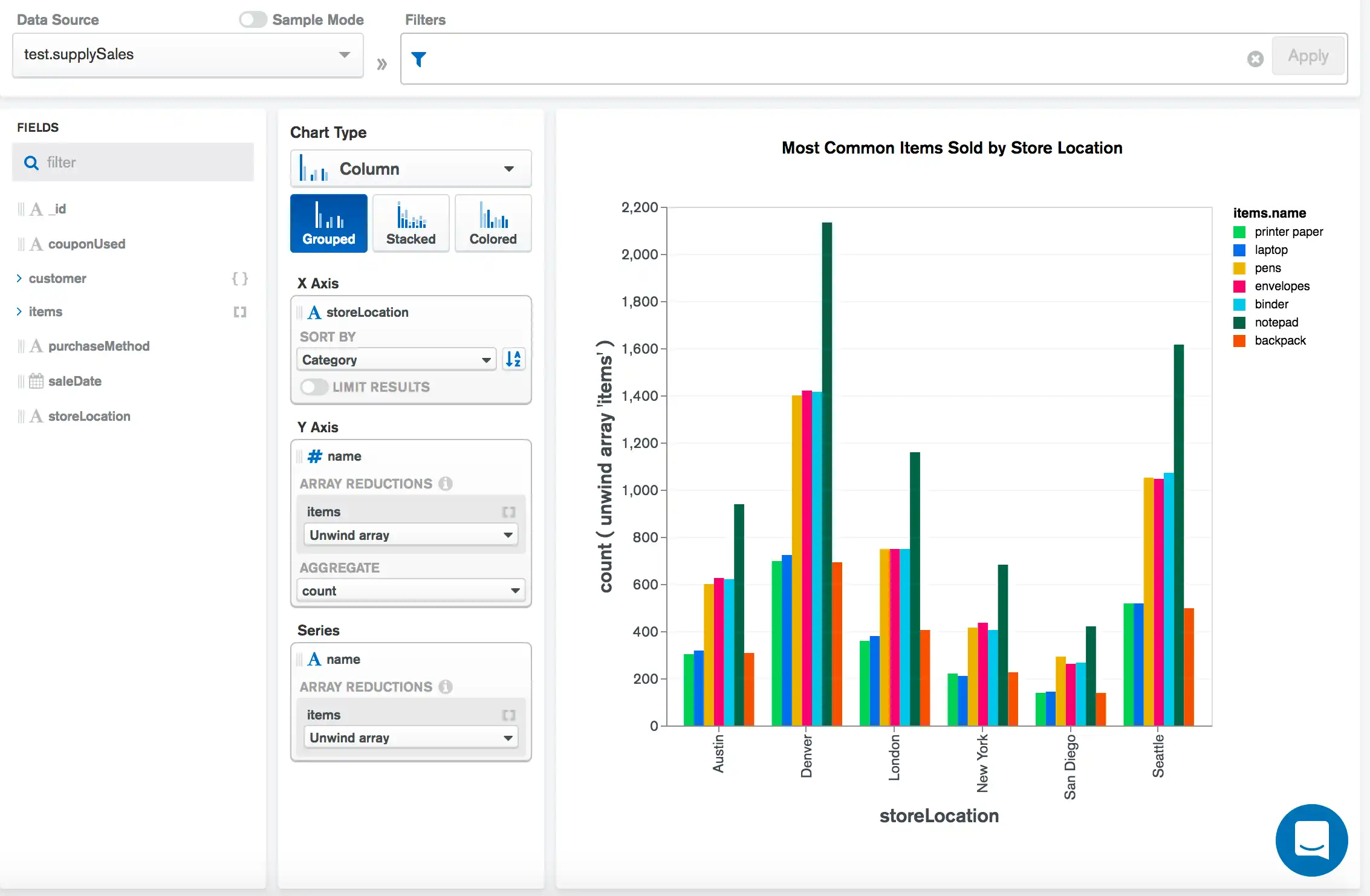
The following grouped column chart shows the most common items sold from an office supply store across several store locations.
The X Axis category of storeLocation creates a group
for each store location in the data set, and each group is split by the
series column of item.name. This ultimately displays
the count of each item's name sold at each store location:
Stacked Column Chart
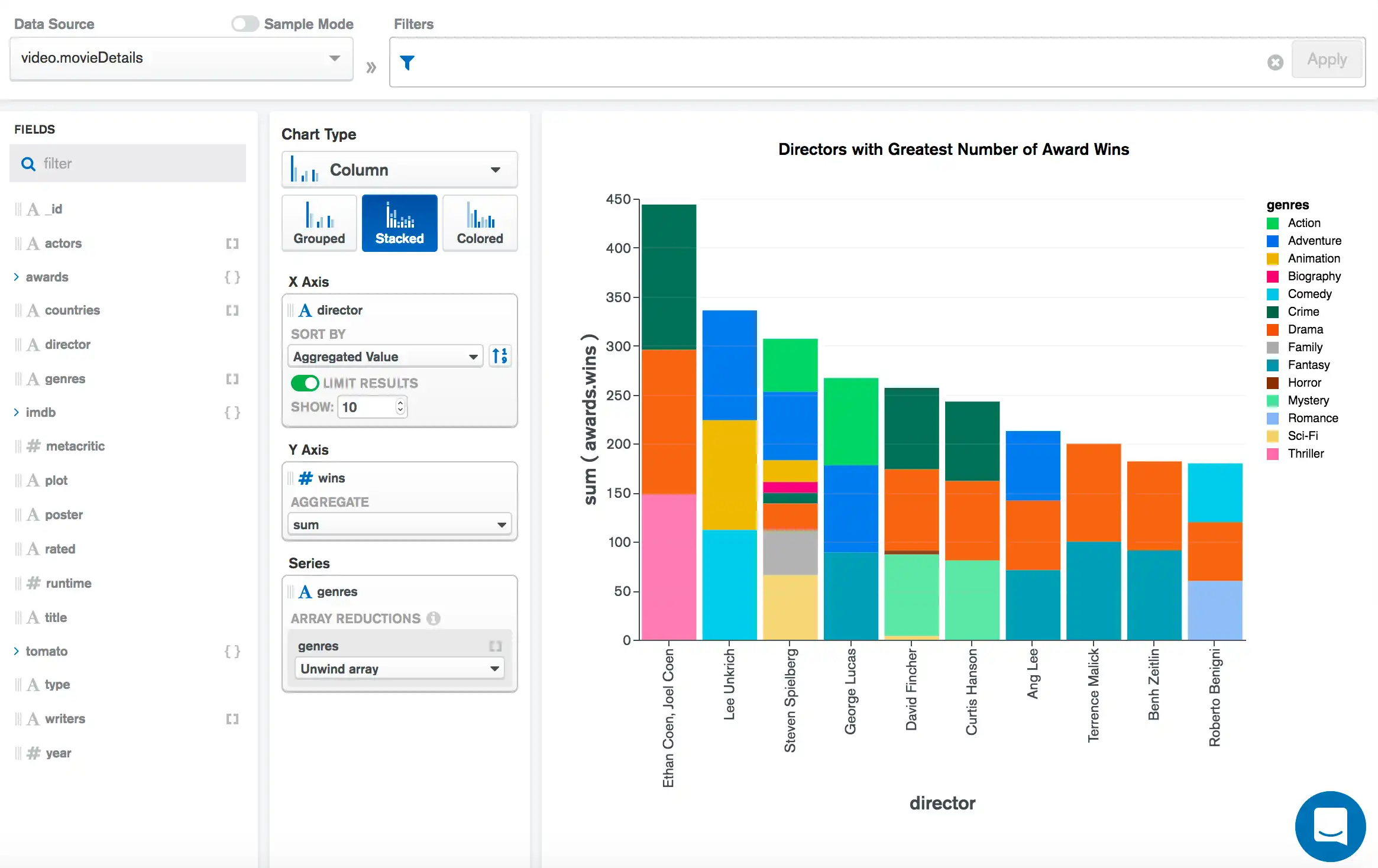
The following stacked column chart shows the number of awards won by the top 10 highest award-winning movie directors, with each bar segmented by the genres of films directed by that director.
The X Axis category of director creates a column for each
director in the data set, which we limit to
only the top 10 as sorted by the aggregated sum of awards.wins from
the Y Axis. The Series encoding channel field
of genres segments each column to portray the genres of the films
directed by that director:
100% Stacked Bar Chart
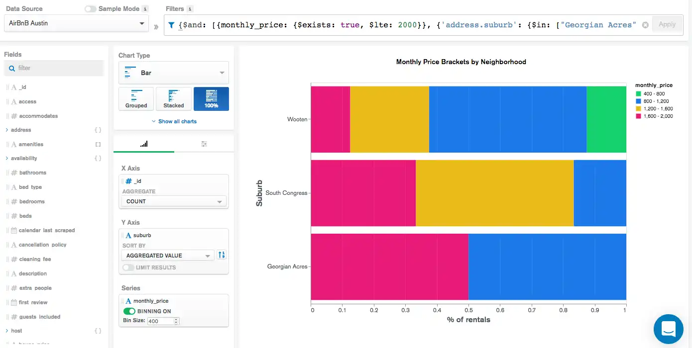
The following 100% stacked bar chart visualizes the monthly cost
of renting a home in three different suburbs of Austin, Texas, USA.
Using a 100% stacked chart allows us to easily visualize
the percentage of rental homes in each monthly_price
bin within each neighborhood. This provides a
clear picture of how these neighborhoods generally compare on rental
prices.
This is the complete filter used for this chart:
{ $and: [ { monthly_price: { $exists: true, $lte: 2000 } }, { 'address.suburb': { $in: ["Georgian Acres", "South Congress", "Wooten"] } } ] }
The Y Axis category channel creates a bar for each of the
three suburbs in the filter. The X Axis channel aggregates
to obtain a count of documents matching each respective suburb. The
Series encoding channel of monthly_price splits each
bar into categories colored according to the legend on the right
side of the chart:
Colored Bar Chart
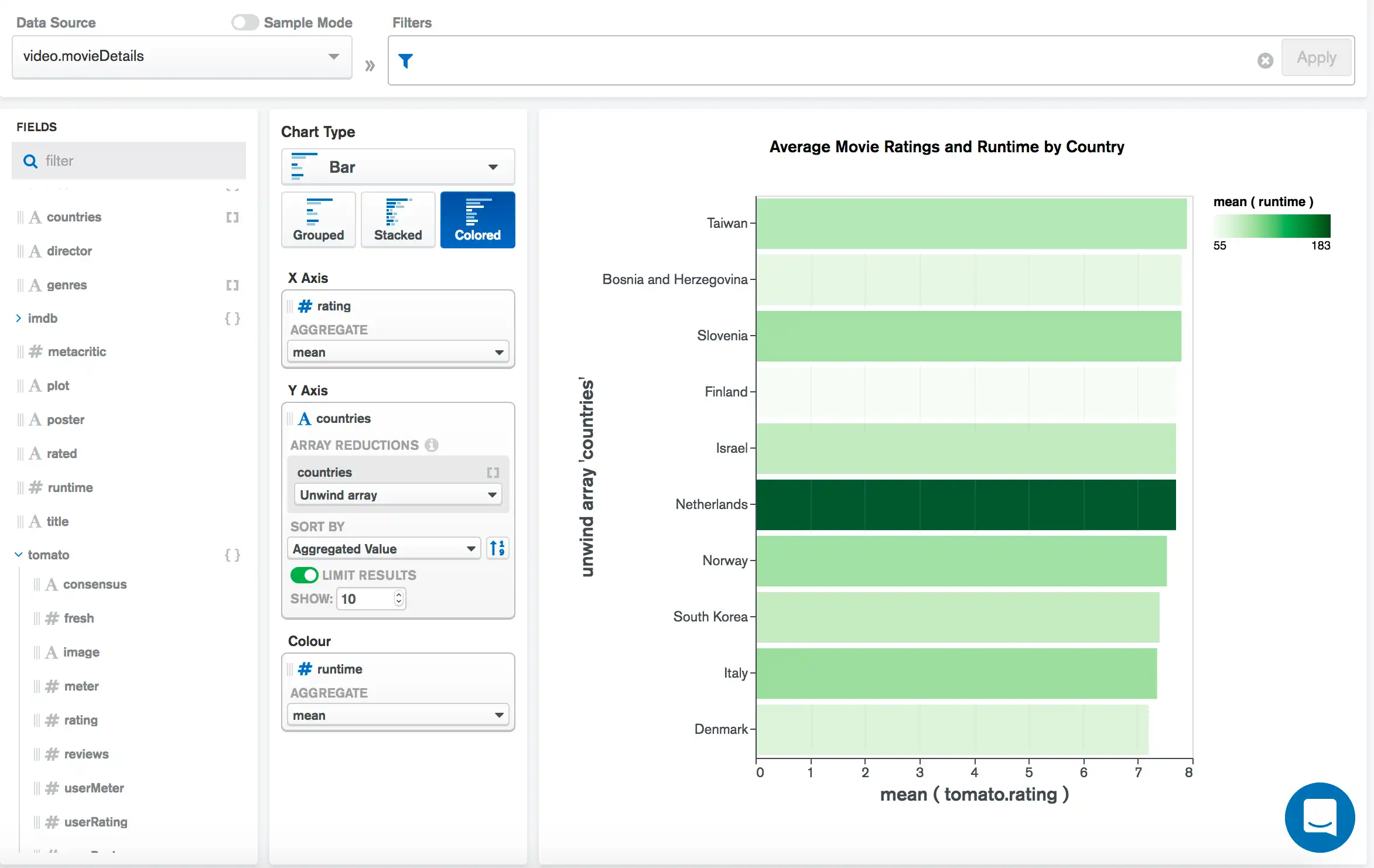
The following colored bar chart shows the average Rotten Tomatoes rating for countries with the 10 highest ratings, and colors each bar to show the average runtime for movies from each country.
The Y Axis category creates a bar for each country in the
data set, which we limit to only the top 10 as sorted by the aggregated
mean of the tomato.rating field from the X Axis. The
Color encoding channel field of runtime colors each bar
to show the average runtime for movies from each country. A darker
shade of green indicates a longer average runtime:
Limitations
The maximum query response size for column and bar charts is 5000 documents.