Time to Complete: 5 minutes
In the final chart of the dashboard, highlight some of the customer analytic information available in the schema using an area chart. By visualizing the age range and distribution of store customers, you can ensure that any advertising the store performs is directed where it will be seen by the most potential buyers.
Construct the Chart
Select the dashboard.
From the Dashboards page, select the dashboard where you want to add a new chart. For instructions on setting up a dashboard, see Dashboards.
Select the Chart Type
In the Chart Type dropdown, select Area.
Click Discrete below the dropdown.
Example
Area Chart
An area chart is a good choice to easily visualize the ages where customers are the most concentrated. Since you are not concerned with exact values in this scenario but rather general trends, an area chart makes more sense than a line chart because the filled-in visualization allows us to more easily identify the most common age ranges.
We use a discrete area chart, rather than continuous, because we are ultimately looking for a count of the customers in each particular age bracket determined by the chart's bin size. Discrete charts allow us to perform aggregation operations on the data, whereas in a continuous chart each data point must come from a distinct document.
Add the desired fields to the proper encoding channels.
In the Fields section click the
customerfield to expand thecustomerobject and view its properties.Drag the
customer.agefield to the X Axis encoding channel. The X Axis encoding channel dictates which field to display on the horizontal axis.Set the Bin Size to
5.Example
Data Binning
Binning data groups continuous data into bins of a specified size. In this case, rather than plotting points for each individual age in the dataset, the data is grouped into bins of
5ages. This provides a clearer look into the overall trend of the age distribution.For more information on data binning, see the Data Binning section.
Drag the
_idfield to the Y Axis encoding channel. The Y Axis encoding channel determines which field to use for the chart's aggregation.Example
Y Axis Encoding Channel
Because we will be performing a $count aggregation on the documents, it does not matter what field we use for this encoding channel because the chosen field does not affect the number of documents in each bin.
In the Y Axis Aggregate dropdown, select count. This option counts the occurrence of each customer age from each sale and adds it to the visualization after placing it in the appropriate bin.
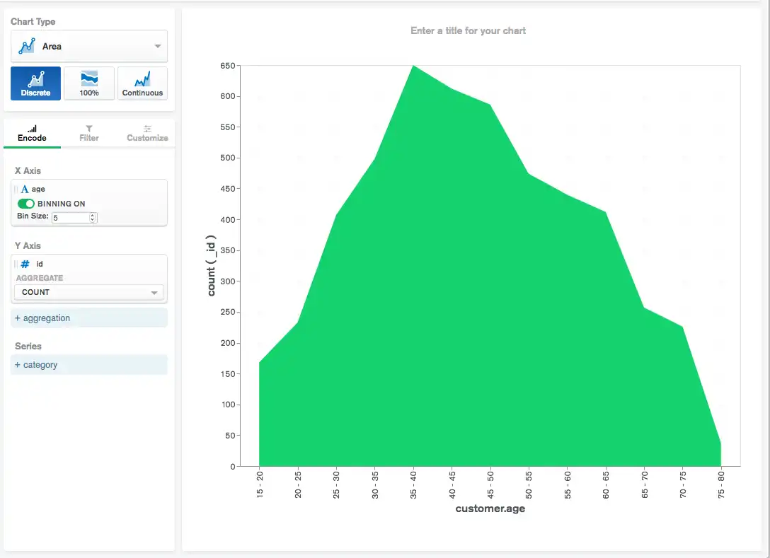
Your chart should now look something like this:

Customers appear to be mostly between the
ages 40-45. This is where the largest area region in the
chart occurs. Additionally, the rest of the ages appear to be
normally distributed,
meaning the average customer age is at the center of the area chart
and there are the same number of younger and older customers. You can
use this information to direct advertising where the largest
customer age group is most likely to see company advertisements.
Wrapping Up
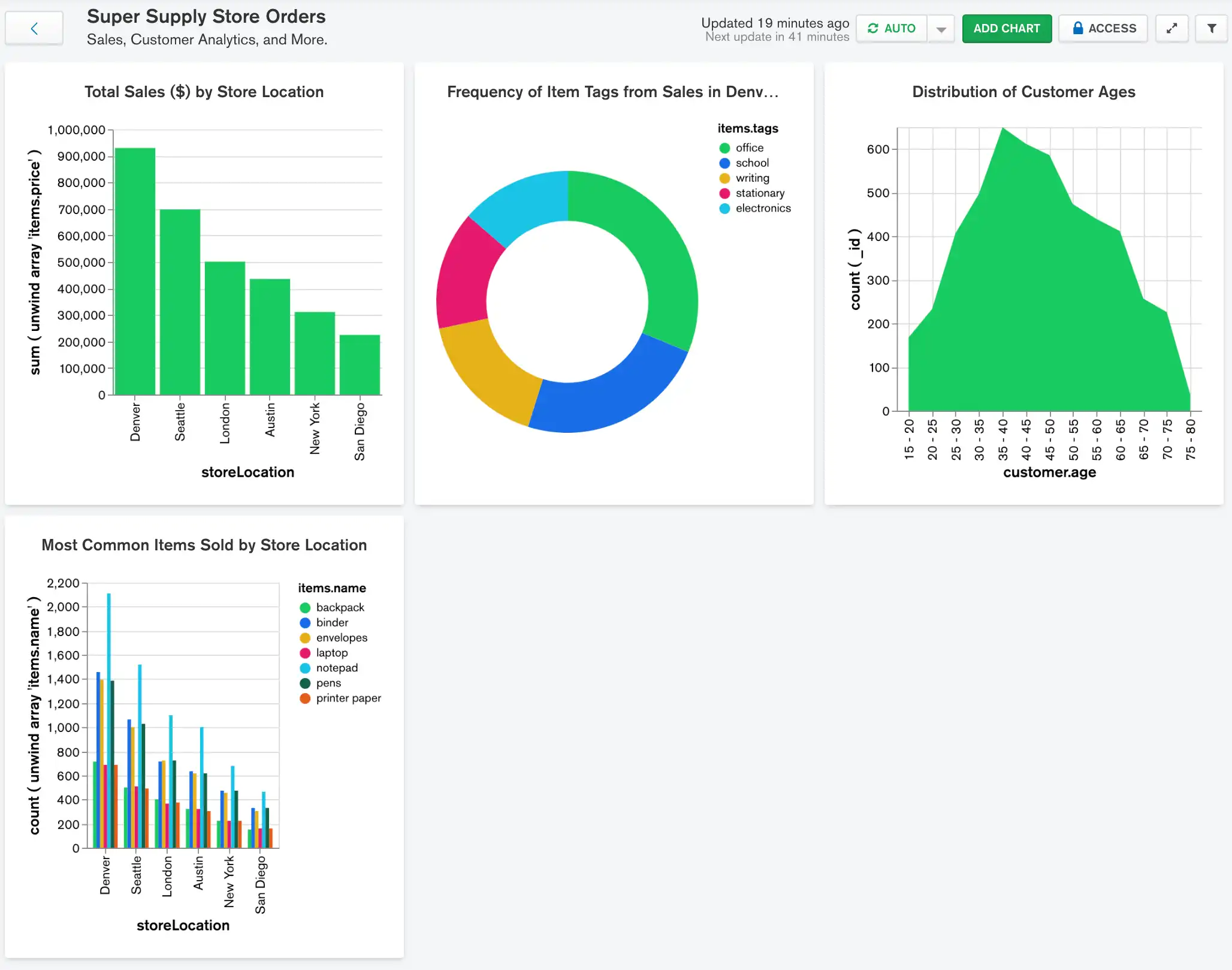
You now have an effective orders dashboard which provides easily accessible insight into revenue data, sales details, and customer analytics. However, with the information you have available in your dataset, there are several ways in which you might be able to add additional charts and extend the dashboard even further. You may want to depict:
Average customer satisfaction by store location
The amount of money that customers in various age groups typically spend on a purchase
Which items are most commonly bought in bulk, utilizing the
items.quantityfield
Try adding some of these additional charts to the dashboard and see what other interesting correlations between variables you can discover.
