Applying Maslow’s Hierarchy of Needs to Documentation
February 17, 2021
In his groundbreaking 1943 paper, psychologist Abraham Maslow theorized that all humans are motivated by five categories of needs: physiological, safety, love and belongingness, esteem, and self-actualization.
Known today as the "Hierarchy of Needs," this theory is often depicted as a pyramid, for only when one stage is fulfilled can an individual move on to the next.
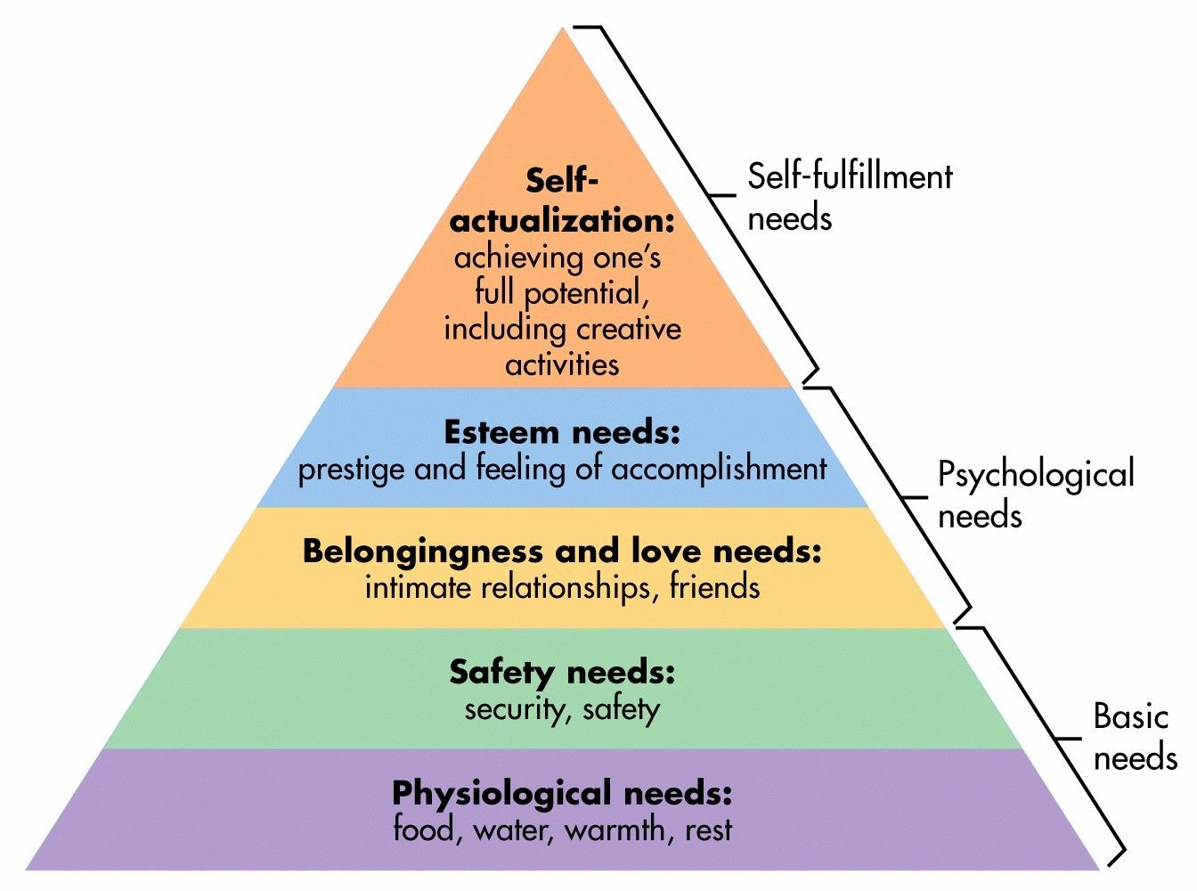
Not only does this theory apply to motivation, but also it applies to the efficacy of a user’s experience. Although Maslow's Hierarchy of Needs was originally intended for psychological analysis, a modified version can also be applied to users in today's digital world.
At MongoDB Documentation, we strive to help users meet their learning objectives effectively and efficiently. With Maslow’s theory in mind, we created a framework for our projects that took Maslow's principles into account. We call this framework "Documentation's Hierarchy of Needs.
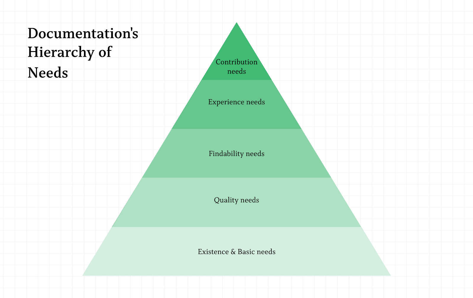
Stage 1: Existence & Basic Needs
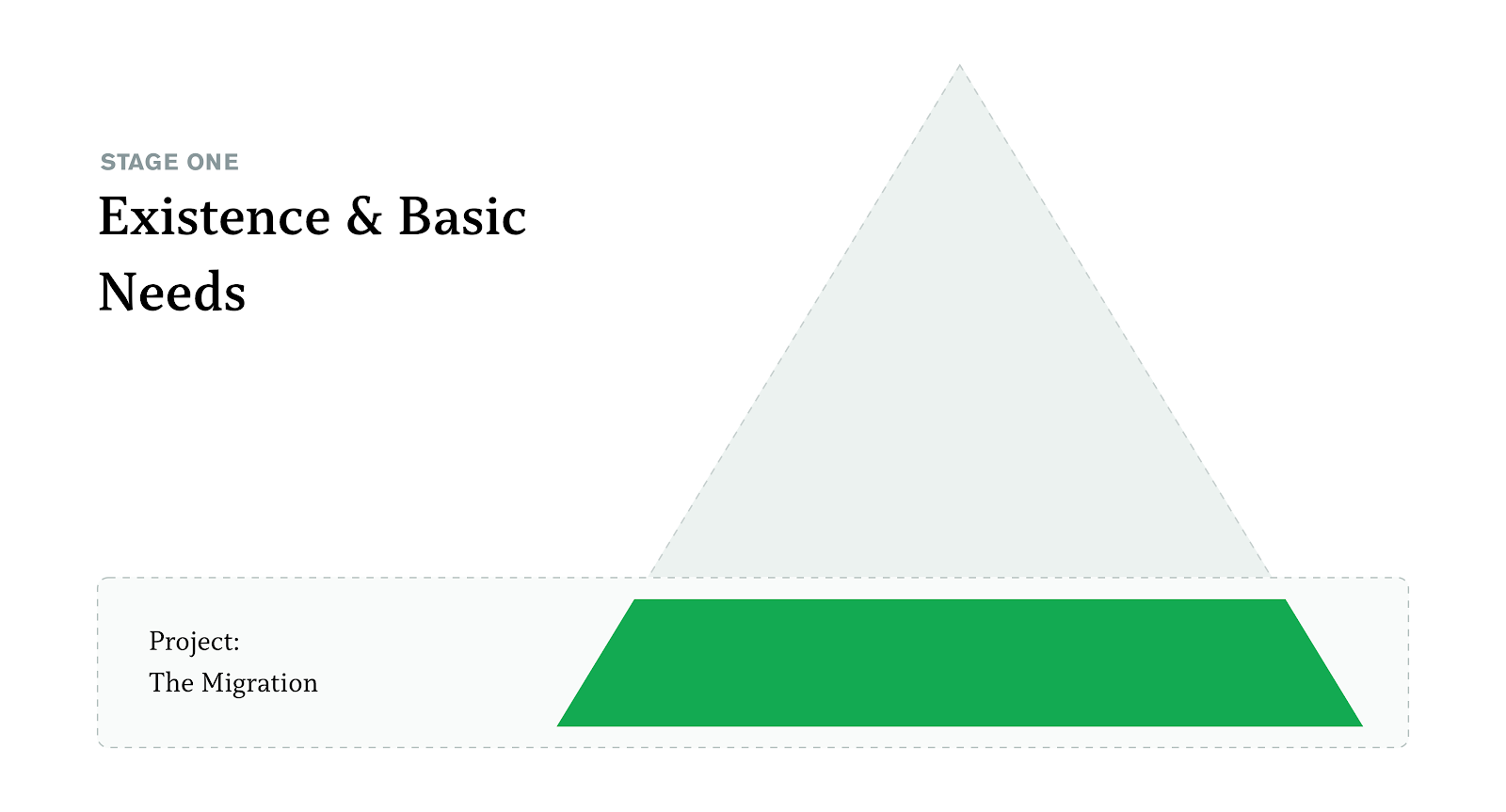
The first layer of the Doc’s Hierarchy of Needs is existence. At the fundamental level, if content does not exist, a user cannot use it. In order for content to effectively exist, the platform needs to:
- Allow writers to write and publish documentation.
- Have a frontend where users can easily access content and content is displayed in an accessible, intuitive manner.
To address this, the documentation platform team has engineered a toolchain that enables authors to write, preview, review, and publish content to the documentation corpus to be accessed by any user.

It sought to enable writers to write and focus on the content they were delivering rather than get bogged down in the tools they were using to write. The toolchain itself converts content to be data, which allows the content to be easily organized, structured, reused, standardized, and tested. Whereas older technologies introduced friction into the design and development process, our new platform included a more flexible frontend to quickly iterate and improve experiences for the users accessing the content.
All of this means that content can easily be written, published, and accessed.
Stage 2: Quality Needs
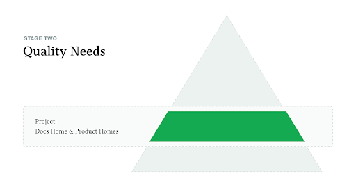
The second layer of the Doc’s Hierarchy of Needs is quality. If the content isn’t of high quality, it isn’t beneficial to a user.
From user research, we learned that when creating higher-quality content, you want to adhere to the following criteria:
-
Be task or use case centric.
-
Come off as approachable, helpful, and informative.
-
Create emotions of confidence, excitement, and determination.
We took these traits into consideration and rethought a few key touchpoints our users interact with. This includes a new docs homepage and a series of new docs product landing pages. As these pages are frequently first-touch experiences, it was important for us to provide a positive initial impression and introduction.
Docs Homepage
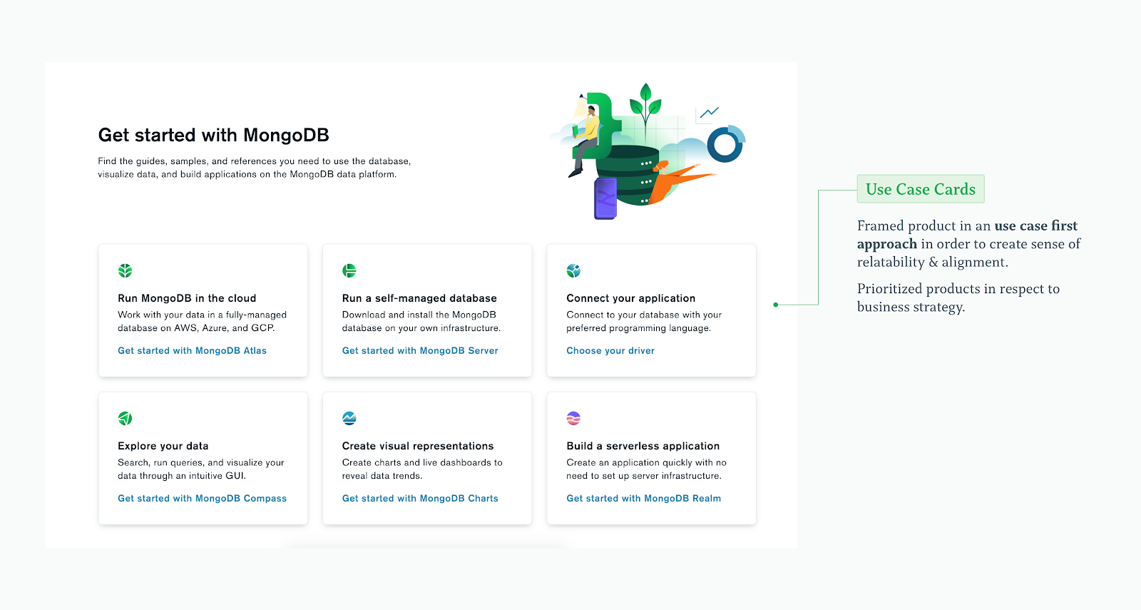
Prompting users with relatable tasks
Throughout these cards, users are given the opportunity to immediately get to the product documentation they need. In order to match the user’s mental model, all cards are written to emphasize tasks.
Leading users to a through introduction
Throughout extensive user research, we learned that users have difficulty understanding the fundamental differences between MongoDB and traditional relational databases.
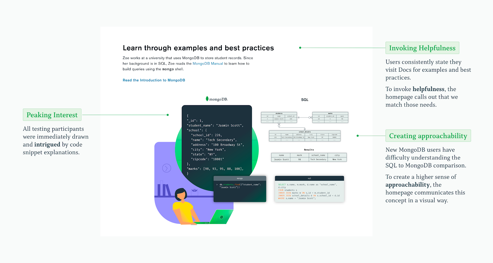
In this section, we wanted to give users a taste of what that was and leave them intrigued and informed on where to learn more.
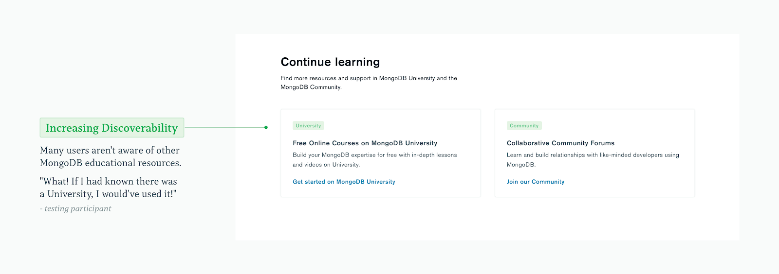
Connecting users with other learning resources
This section keeps the ball rolling. At the beginning of their journey, the user receives a broad overview, before working their way through basic concepts. At the end of the page, they are encouraged to continue their learning and explore our other educational platforms.
Docs Product Landing Pages
Creating consistency in user goals
At this touchpoint, users are entering a specific product learning experience. In order to supplement our users’ learning journeys, these pages are focused on increasing product fluency and adoption.
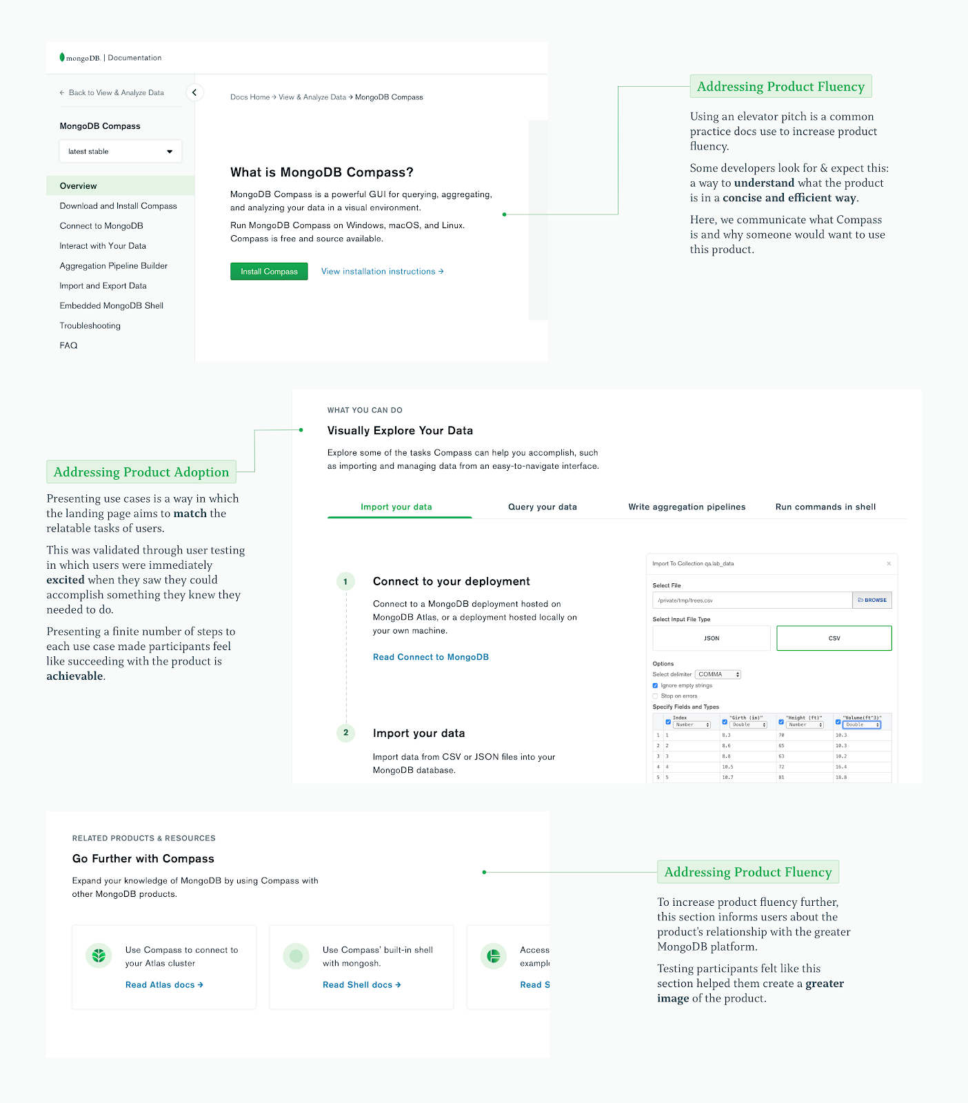
Creating emotions of excitement and confidence
In testing these designs, users felt that this specific section made them feel the most confident and excited. The use cases outlined quickly jumped out as relatable tasks, the small number of steps made the task feel easily achievable, and the interaction made the information exciting.
Stage 3: Findability Needs
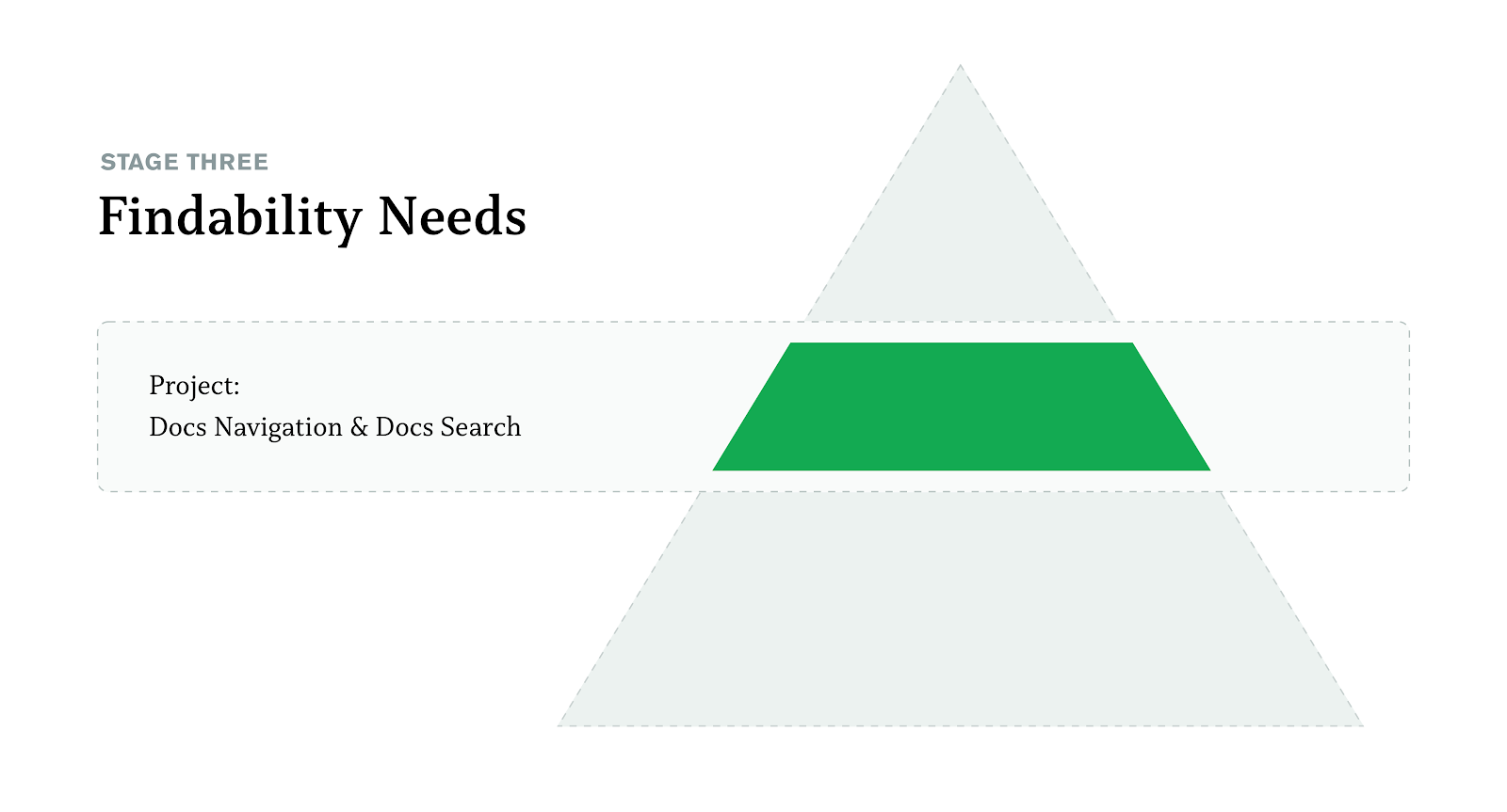
The third layer of Doc’s Hierarchy of Needs is findability. Here, we break through basic needs and head into psychological needs.
Historically, users could still rely on external resources, such as Google, to find the information they required. Of course, this does not provide the ideal experience for our users but meets their basic needs.
One of our main focuses this year was to improve findability and strengthen our navigational experience.
We found that the navigational experiences are mainly split between two persona types: advanced users and first-time learners. Advanced learners are more likely to know exactly what they are looking for, leading them to rely heavily on an effective search experience. On the contrary, learners are less likely to know what they are looking for and are just looking to learn and explore.

Factors for Findability Success
After several rounds of user interviews, literature reviews, and meetings with subject matter experts, we identified the following characteristics of the ideal navigational experience:
Task-Centric Approach
In each round of research, such as card sorting or tree tests, we consistently found that users approach navigation based on their own experience or knowledge.
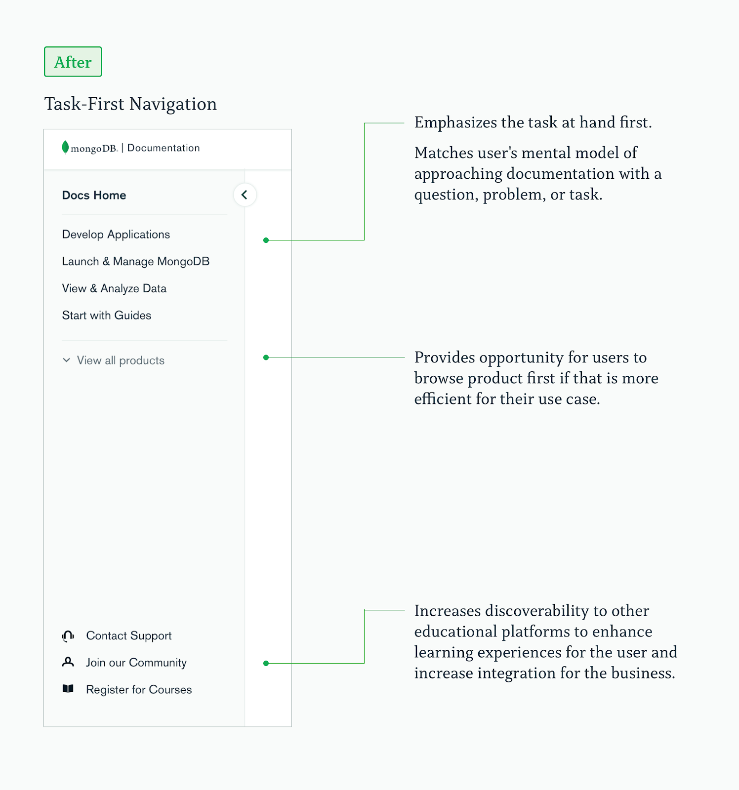
Because of this finding, we implemented a task-centric approach in the revamp of Docs Navigation. By mirroring users’ mental models, this navigational model takes some of the heavy lifting off the user and creates an intuitive experience.
Importance of Efficiency and Accuracy
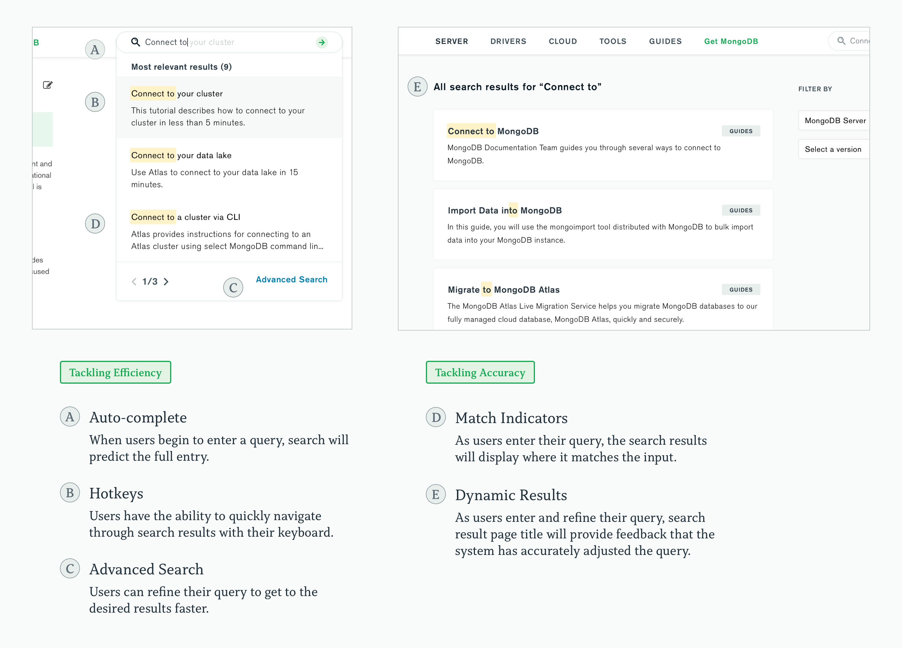
Users ranked efficiency and accuracy as the most important factors when navigating. In fact, many users, specifically developers, measure efficiency in number of clicks.
To maximize the efficiency of the search engine, we provided context clues to users. This enabled them to determine the most relevant results and apply additional filters for improved accuracy.
These findings became pivotal when envisioning a new Docs Search and pinpointing valuable features that would optimize for these factors.
A New Docs Nav


A New Docs Search
Small Snacks
Upon the release of these projects, the documentation platform team has enjoyed looking at the resulting analytics, which has inspired us to further improve findability and quality. For example, with information about what queries users are searching for, we can make decisions around what we want to optimize next.
A fun tidbit we saw in our analytics concerned user preferences around full page search vs. a modal. In our research, we found that there was a split in affinities toward each approach, and as a result, it was difficult to make an informed decision on which to invest in.
Instead, we decided to build both, as this extra work increased scope by only one engineering day. We have since found that they are being used to an equal degree.
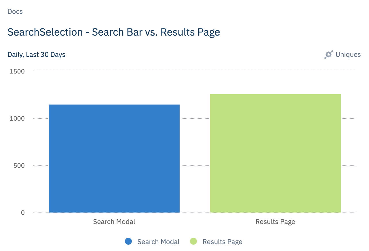
How fun! This leads us to believe that we are providing further psychological safety to our users by letting them navigate through how they desire.
Stage 4: Experience Needs
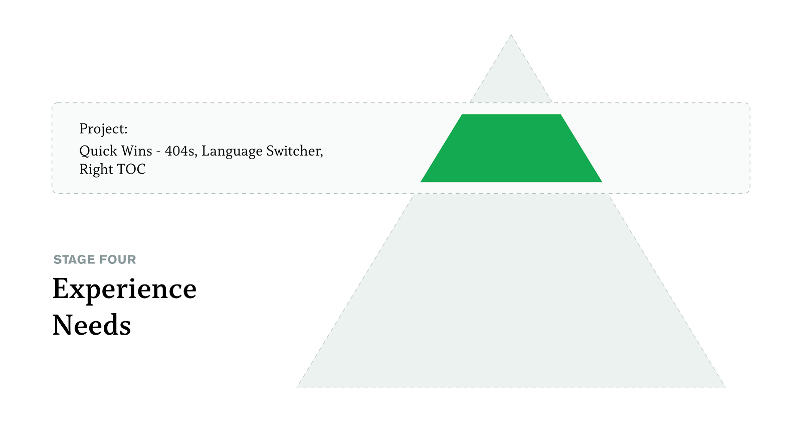
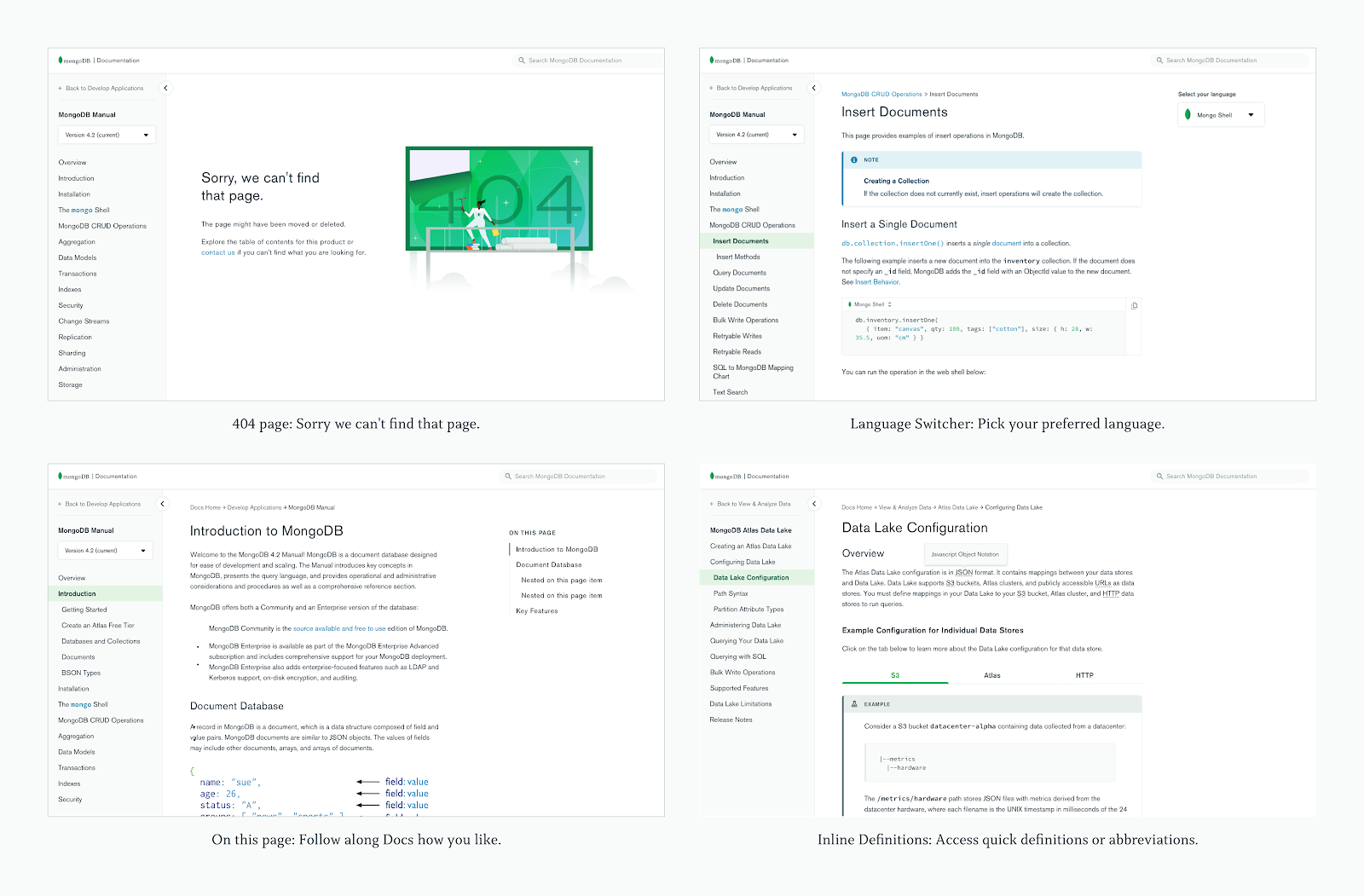
The fourth layer of the Doc’s Hierarchy of Needs is experience, which encompasses the finishing touches. The difference between delight and neutrality, intuition and frustration, the ooo’s and the ugh’s.
Internally, we've made improvements to the platform that increase writer efficiency and productivity so that writers can create better documentation. Research indicates that if an employee is happy with their set of tools, the work they produce will be better as well.
Stage 5: Contribution Needs
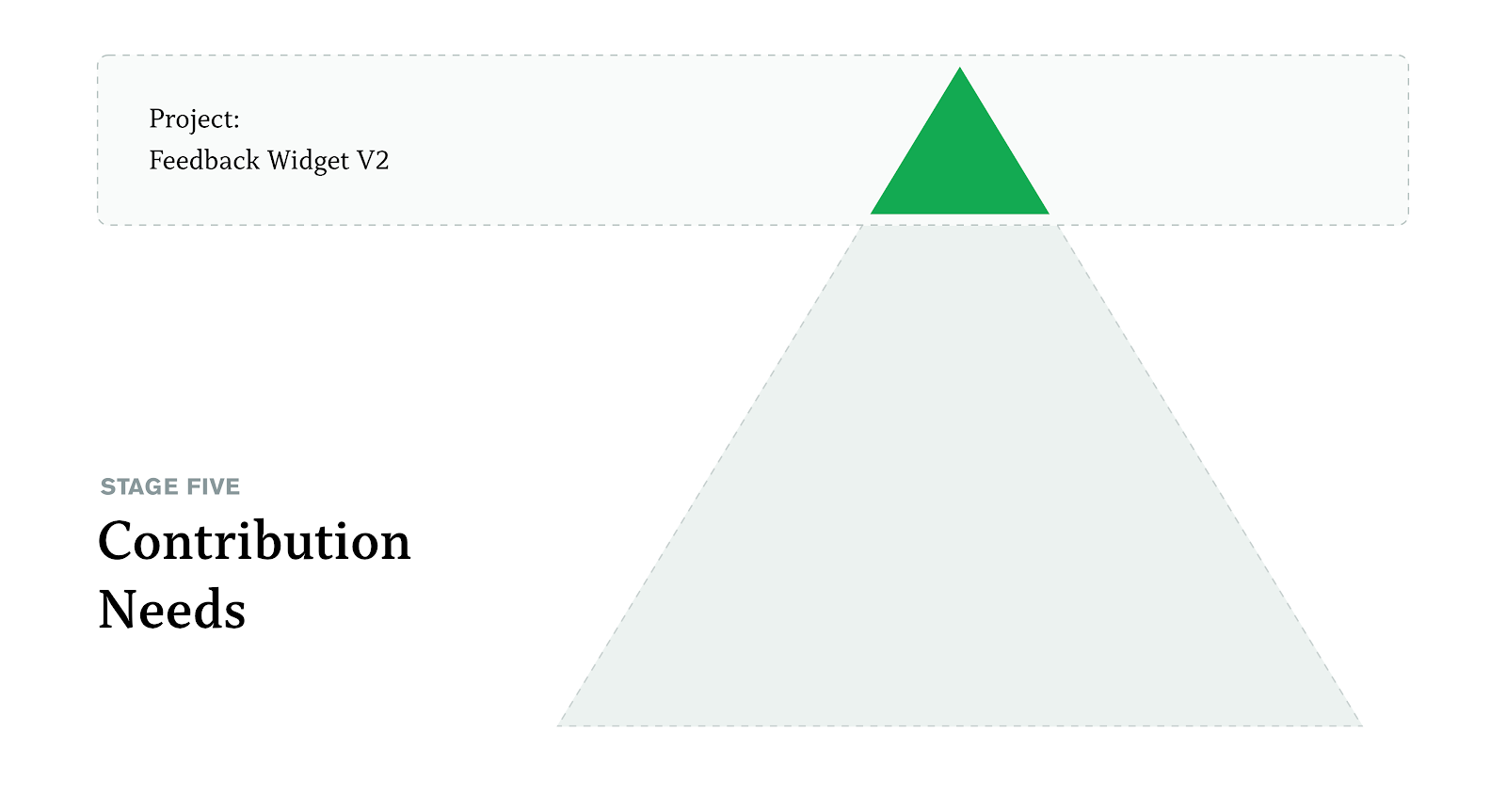
The last layer of the Doc’s Hierarchy of Needs is contribution. Once the content exists — and it's of high quality, it's easily findable, and the experience is superb — users feel they should be able to contribute and be a part of the effort.
From user research, we’ve heard that “contribution needs” include:
-
Feeling that they can help Docs improve.
-
Being able to report their own problems.
-
Joining a community.
Creating an open source platform
Users who regularly read the documentation are also able to contribute directly by making a pull request to Github. This directly relates to self-fulfillment as it is defined in Maslow’s Hierarchy of Needs, because we are encouraging users to achieve their full potential by participating in the growth of the platform.

Improving the Feedback Widget
After receiving user feedback, we focused on the following points to improve in the next iteration:
Interface with content
The previous feedback widget was visually covering the actual documentation content. It also had no way to hide or dismiss its presence.
To address this, the new feedback widget was de-emphasized in the view, keeping the priority on the content itself.
Quality of feedback collected
Internally, the feedback widget was not helpful because it didn’t provide enough context for writers to make quality improvements.
To address this, the new feedback widget introduced new categories that allowed users to add specific classifiers to their entry.
Introduction of helpful next steps
In addition, users frequently confused the feedback widget with a support center. This created a large number of tickets that often could not be acted upon.
To address this, the feedback widget connects these users to better fit resources such as the Community or the Support Center.
This connection also creates an opportunity for users to join the rest of the MongoDB Community and connect with other like minded individuals.

Results/Learnings
In doing so, we have successfully eliminated all noise in the feedback widget directly relating to it interfering with the content on the page. We have seen an increase in the quality of feedback as a result of the more detailed rating system and self-selection of categories. We have also seen a broader decrease in the quantity of feedback — and thus, less chaff to sift through than before.
Looking Towards the Future
We like to think that this helps us create a holistic docs experience, as we are touching on key parts of the user journey. It puts the user at the center of all product strategy and design which is extremely important to us as a team. Additionally, it provides a helpful framework for what we plan to do next!